LinkedIn carousel: size, specs and how to post one in 2026
A LinkedIn carousel is a PDF uploaded as a document post, which readers swipe through one page at a time. LinkedIn takes files up to 100 MB and 300 pages, and doesn't set a pixel size for documents: it only asks that every page be the same size. Everything else is method: a cover that makes a promise, one idea per page, and a caption that makes people open the document. Thumbs ready to swipe.
📄 What is a LinkedIn carousel?
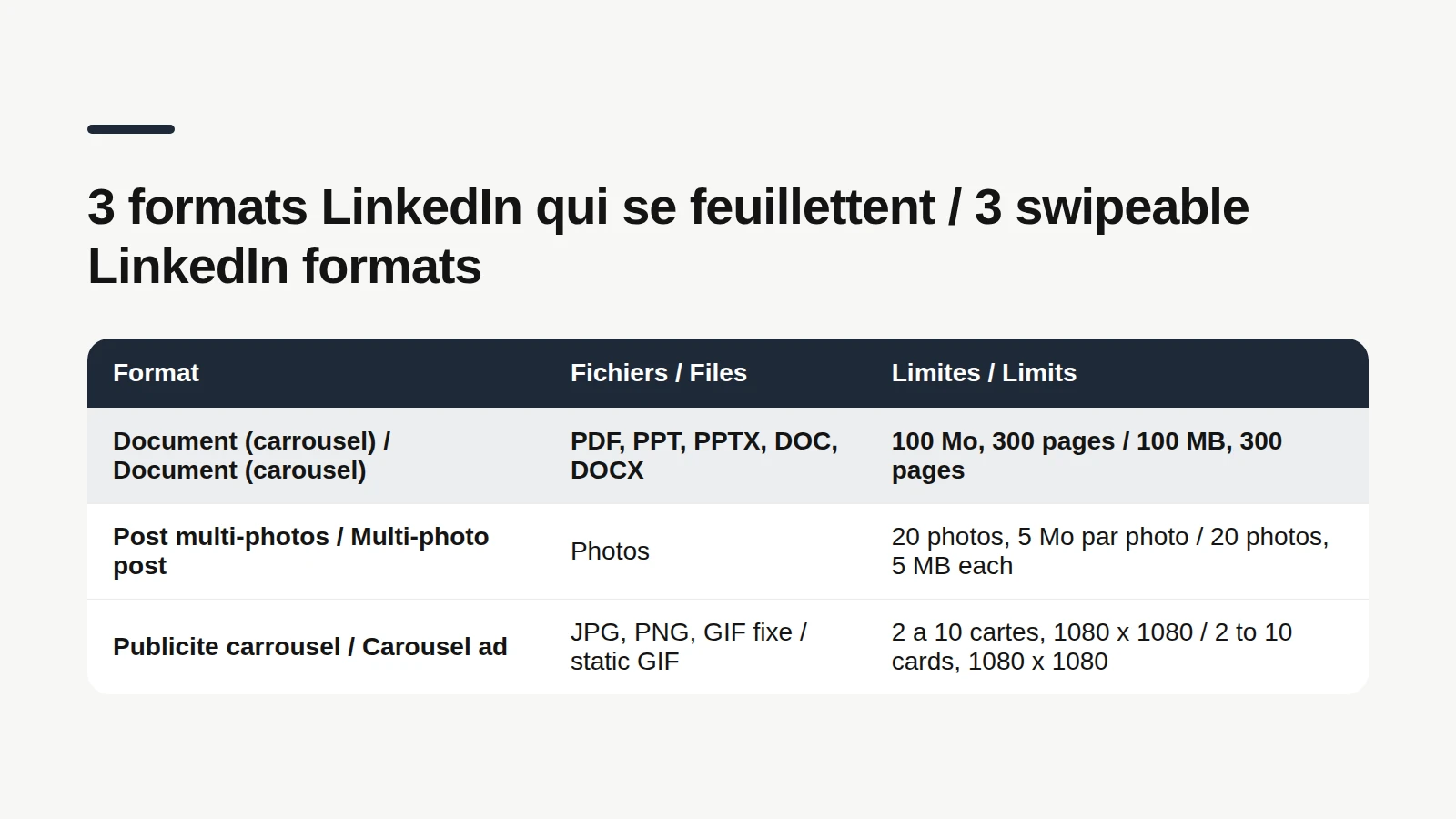
A LinkedIn carousel is a post that carries a multi-page document, shown in the feed like a small slide deck people swipe through. LinkedIn's interface doesn't actually call it a carousel: it's the "Add a document" option in the post composer. The name came from users, and it stuck. According to LinkedIn's help center, the document can be a PDF, a PowerPoint (PPT, PPTX) or a Word file (DOC, DOCX), up to 100 MB and 300 pages. Anyone who can see your post can also download it as a PDF, for accessibility reasons. In other words, your carousel may end up in someone's "read later" folder. Make it worth keeping. So, does LinkedIn do carousel posts? Yes, in three different ways that people mix up: Document posts (the organic carousel): one file, with pages people swipe through. Multi-photo posts: up to 20 images, laid out according to the first one. Carousel ads: a paid Sponsored Content format with 2 to 10 cards, where each card can point to its own page. This guide covers the first one, the one anyone can post for free from their profile.
The caption, without the blank page
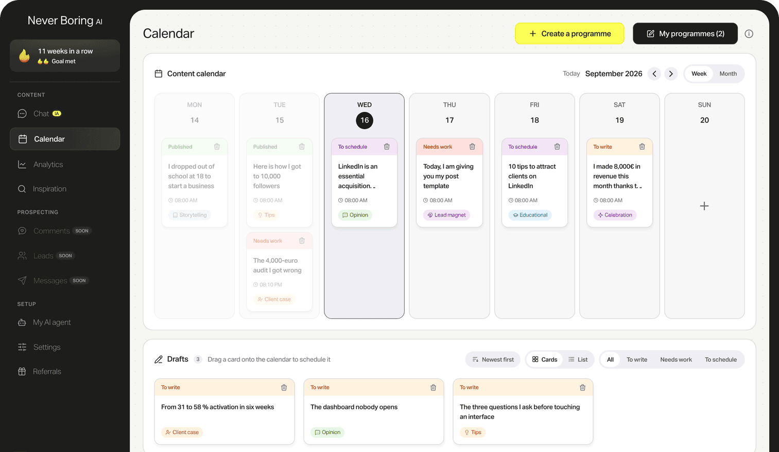
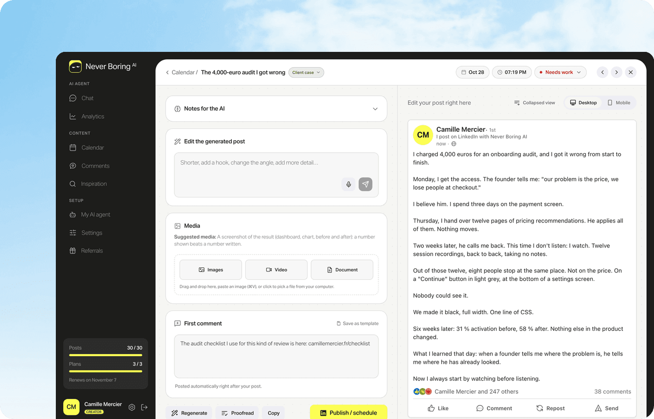
A carousel needs a caption that makes people open it. Never Boring AI's AI LinkedIn post generator writes it in your voice, from your offer and your own stories. Then you attach your PDF to the post.
📐 LinkedIn carousel size and specs in 2026
Short answer: a PDF whose pages are all the same size, either square (1080 x 1080 px) or portrait (1080 x 1350 px, a 4:5 ratio). Here's where those numbers come from, because LinkedIn's help page on documents doesn't give any pixel size. What it does spell out: File types: PDF, PPT, PPTX, DOC and DOCX, with PDF recommended for the best upload quality. Limits: 100 MB and 300 pages per file. Layers: flatten or merge multi-layer PDFs. Page size: every page must be the same size. Animations: videos and animations aren't supported and show as static images. Title: add one, so people know what the document is about. For dimensions, borrow the guidance LinkedIn publishes for its other formats. For photos, it recommends 1080 pixels wide and accepts ratios up to 4:5 portrait. For carousel ads, it recommends 1080 x 1080 px, square. Hence two picks that match that guidance: square, safe and simple, or 4:5 portrait, which takes more vertical room in the feed. Working in inches? Keep the ratio, for example 8 x 8 in or 8 x 10 in.
🛠️ How to make a LinkedIn carousel in 5 steps
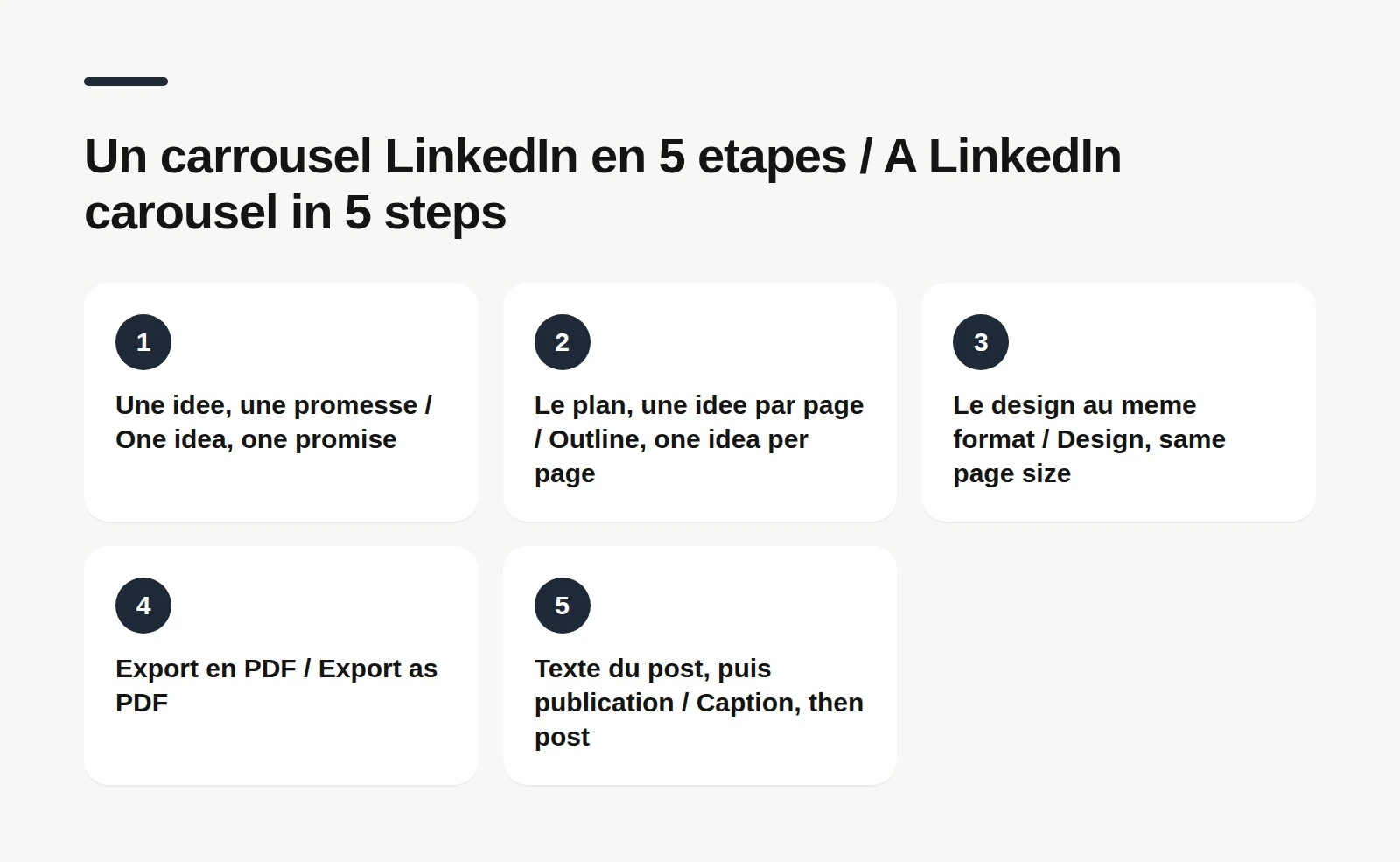
A good carousel works like a mini-course, not a brochure. Five steps: 1. One idea, one promise. A single question the carousel answers, written as one sentence. If the sentence needs an "and", you have two carousels. 2. The outline, one idea per page. A cover page, one page per idea, a closing page. Five ideas means seven pages. 3. The design, same size throughout. One template, two or three colors, a readable font, and the same page size from start to finish (LinkedIn requires it). 4. Export as PDF. Flattened, no animations, with a clear file name. 5. Write the caption, then post. The caption is what people read before they touch your carousel. Any tool that exports a PDF will do: Canva, Figma, PowerPoint, Keynote or Google Slides. Searching for a "LinkedIn carousel template" or a "carousel maker" is fine to get started, but the tool matters less than the outline. A badly planned carousel stays badly planned, even with a gorgeous gradient.
✍️ LinkedIn carousel examples: three outlines you can reuse
Here are three outlines that fit most topics. Picture Jake, a freelance designer (a made-up example, not a client). The list: "5 mistakes that make a logo unreadable". Cover, one mistake per page with a before and after, a recap page. Seven pages. The step by step: "How I prep a brand workshop in 4 steps". Cover, one step per page, a checklist page at the end. Six pages. The myth buster: "3 things clients get wrong about logo pricing". Cover, one myth and the reality per page, a closing question. Five pages. Whatever the outline, three rules hold: The cover works alone. In the feed, it's the only page people see before they swipe. It has to say what they get by continuing. One page, one idea. If a page needs a second read, split it. The last page recaps. Someone who skipped three pages should still get the point in one. What is the purpose of a carousel, then? To teach something in steps people can follow at their own pace. If your idea fits in one sentence, a text post will probably serve it better.
Your cover page is a hook
The first page of a carousel does the same job as the first line of a post. Our LinkedIn hook guide shows how to write one, with examples by post type.
📤 How to post a carousel (PDF) on LinkedIn, desktop and mobile
On desktop, according to LinkedIn's help center: 1. Click "Start a post" at the top of your homepage. 2. Click "More", then the "Add a document" icon. 3. Click "Choose file" and pick your PDF. Dropbox and Google Drive work too. 4. Add a title to your document and click "Done". 5. Write your caption (mentions and hashtags allowed) and click "Post". On mobile, the path is the same: tap "Post", the "More" icon, then "Document", pick the file, add the title, tap "Next", write the caption and tap "Post". To upload from a cloud service, you need its app on your phone. The catch to know before you hit Post: once it's live, the document can't be edited. You can change the description or delete the post, but you can't swap the PDF. A typo on page 4 means posting again. So proofread every page, not just the cover. And if you were looking for how to post a PDF on LinkedIn for any other reason (a report, a one-pager), it's exactly the same flow.
💬 Writing the caption that goes with it
A carousel never travels alone: it sits under a caption, and the caption often decides whether anyone opens it. It doesn't have to say everything. It names the problem, says what readers will find in the document, and lets the pages do the rest. A simple structure: A first line that gives people a reason to stop scrolling. Two or three sentences about the problem, with one concrete detail from your work. One line that points to the document ("All 5 mistakes, with a before and after for each, are in the PDF"). An open question at the end, to get the comments going. And don't skip the document title: LinkedIn's help center suggests adding one so people know what the document is about. Pick it like a headline, not a file name ("5 logo mistakes" beats "carousel_v3_final_FINAL").
📊 What 1,475 posts from our users show
Guides talk about carousels a lot. To see how much room they actually take, we queried Never Boring AI's database on November 17, 2026. The method: 1,475 posts published on LinkedIn by 18 users who connected their account, from September 19, 2024 to November 16, 2026. Team, demo and test accounts excluded, reposts excluded, posts under 50 characters excluded. 15 of the 18 accounts use the app in French, so this is a mostly French-speaking sample, not a US benchmark. Here's what it shows: 92 posts use the document format, the one carousels use: about 6% of the total. 10 of the 18 accounts posted at least one. 7 accounts posted 5 or more. The caption on a document post runs 1,140 characters at the median, against 1,088 for all posts. These numbers describe usage, not results. They don't say whether a carousel reaches more or fewer people than an image: reach depends on topic, network and timing, and nothing here was tested. What they show is that carousels stay an occasional format among our users, and that their captions are no shorter than the rest. A PDF doesn't get you out of writing.
Which format for which post?
Text only, image, carousel or video: our LinkedIn post format guide describes what gets published, with its data base, and how to read your own numbers by format.
🚫 Common LinkedIn carousel mistakes
Nothing dramatic, but any one of these can lose your reader halfway: Mixed page sizes. LinkedIn requires the same size for every page; a mix makes a wobbly document. Counting on an animation. According to LinkedIn's help center, it will show as a static image. Your clever transition becomes a frozen page. A layered PDF. Flatten it before uploading, or elements may overlap. Too much text per page. If people have to zoom in to read it, they'll swipe past it. A cover that promises nothing. "My tips" never made anyone swipe. Unsecured links inside the PDF. LinkedIn asks for secure (https) links. A typo spotted after posting. The document can't be swapped, so proofread everything first. And the big one: making a carousel just because it's a carousel. A strong opinion reads better in one go, as a text post. Carousels shine when the content really breaks into steps.
🤖 Prepare and schedule a carousel with Never Boring AI
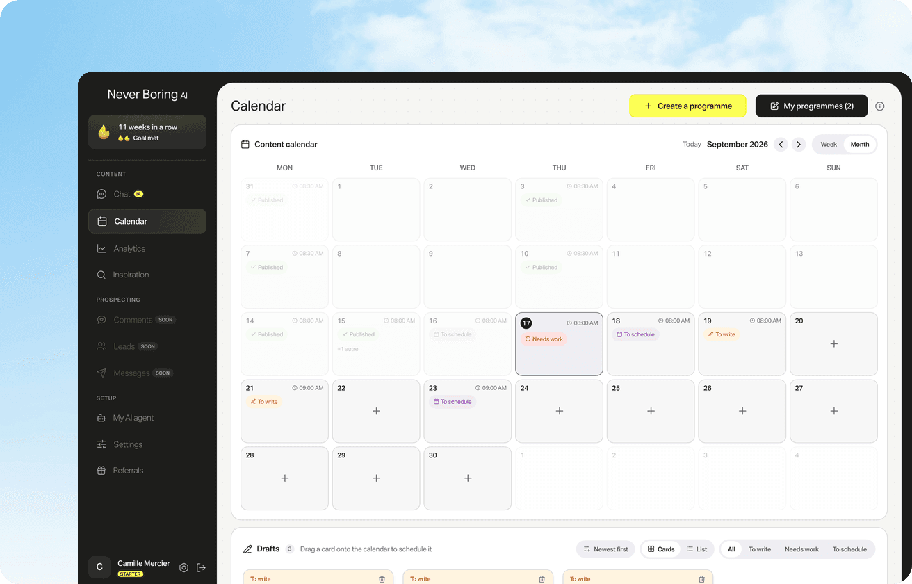
Never Boring AI doesn't design your pages: your PDF comes from whatever design tool you like. It handles everything around it. The agent builds your posting plan from your offer, your audience and your own stories, then the generator writes the caption in your voice. When you pick a Tips or Educational post type, the editor actually suggests a carousel, one idea per page. Then you attach your PDF to the post: the editor takes one document per post, within LinkedIn's limits (100 MB, 300 pages), and shows a page-by-page preview, with arrows and a page counter, just like the feed. All that's left is scheduling: the post goes out on LinkedIn at the time you chose, carousel included. Already have your slides but no time to write what goes above them? That's exactly the part the tool takes off your plate.
Your carousel, posted on time
Attach the PDF, check the page-by-page preview, pick the day and time: automatic LinkedIn publishing does the rest.
Bottom line: one PDF, one idea per page, a good caption
A LinkedIn carousel is a document post: a PDF up to 100 MB and 300 pages, every page the same size, square or 4:5. Build it like a mini-course, with a cover that makes a promise, one idea per page and a closing page that recaps. Post it with "Add a document", knowing it can't be edited afterwards. And give it a caption that makes people want to open it. For that caption and the calendar around it, Never Boring AI drafts your posts in your voice and publishes them at the time you choose, PDF included. Free trial, no credit card.
Your LinkedIn posts, carousels included
Tell the agent about your business: it builds your plan, drafts your posts in your voice and publishes them on LinkedIn, with your PDF when there is one. Free trial, no credit card.
What questions come up most often?
The questions that keep coming up on this topic, and how we answer them.
Use a PDF with every page the same size: square at 1080 x 1080 px, or portrait at 1080 x 1350 px (4:5). LinkedIn's help page on documents sets no pixel size, but it requires identical page sizes and recommends PDF. Those two sizes follow the guidance LinkedIn gives for photos (1080 px wide, up to 4:5) and for carousel ads (1080 x 1080 px).
Read next
Your first content plan and your first 3 posts are on us
Create your account, no credit card needed, and walk away with your first post in minutes. Your LinkedIn calendar then runs on its own.


Already used by
257 founders